
Brand guide
Using the Logo
Logo Do’s
- Do leave enough space around Swimlane brand assets for them to be clear and uncluttered. Always use and use brand assets at a legible size.
- Do use any Swimlane logo only on either a white or dark background. Never use light gray or any other bright color from our brand palette.
- Do use the inline version of the logo in most situations. The stacked version may be used when the logo is the primary focus, typically without any additional messaging or when messaging is distanced from the logo.
Logo Don’ts
Do not alter the logo. Avoid the following common mistakes.
Do not stretch
Do not scale mark or word independently
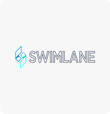
Do not outline
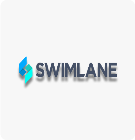
Do not add any sort of effect such as a glow or drop shadow.
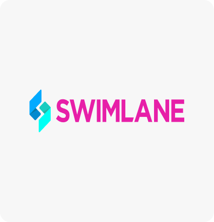
Do not use any color besides the primary brand colors
Do not position on an angle
Do not apply patterns
Do not use the logo mark as pure white
- Don’t combine the Swimlane name or logos, or any portion of any of them, with any other logo, company name, mark, or term. Don’t edit, modify, distort, rotate, or re-color the logos in any way.
- Don’t use the ‘S’ mark alone, the logo should always appear as the mark and logotype. The only exception to this is potentially as a subtle pattern or background treatment, but usage must not conflict with any primary messaging and should not overpower the rest of the design.
- Don’t use full-color logos on photographs unless the logo sits on a dark or white area of the image.
- Don’t use the logotype without the “S” mark. The logo must always appear with both elements.
- Don’t place the logo on a patterned background, or add any sort of effect such as a glow or drop shadow.
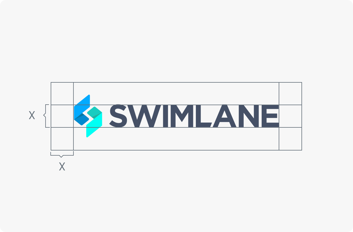
Provide Clearance
Provide enough space around the Swimlane brand assets for them to be clear and uncluttered. always use brand assets at a legible size
Color Specification
Below is the official Swimlane color palette. Avoid deviating from this core set of colors. The brand color palette should be used in a way that conveys a sense of vibrancy while maintaining balance between light and dark. Generally, Midnight or white should be used in backgrounds and floods with contrasting brighter colors providing visual interest. Lochmara and Azure may also be used in floods, where appropriate and not in conflict with other brand elements or messaging.
Color Palette (Hover to copy the hex values)
#007AFF
RGB
0,122,255
CMYK
100,52,0,0
#000743
RGB
0,7,67
CMYK
100,90,0,74
#FF3366
RGB
255,51,102
CMYK
0,80,60,0
#0FB0F4
RGB
15,176,244
CMYK
94,28,0,4
#39CCCC
RGB
57,204,204
CMYK
72,0,0,20
#131724
RGB
19,23,36
CMYK
47,36,0,86
#646F79
RGB
100,111,121
CMYK
17,8,0,53
#C6D1DB
RGB
198,209,219
CMYK
10,5,0,14
#EEF4FA
RGB
238,244,250
CMYK
5,2,0,2
#FFFFFF
RGB
255,255,255
CMYK
0,0,0,0
Gradients (Hover to copy the CSS values)
75 DEG
#FF3366 | #007AFF |
#39CCCC
95 DEG
#000743 | #007AFF |
#0FB0F4 | #39CCCC
RADIAL
#000A59 | #03139A |
#007AFF
93 DEG
#007AFF | #0FB0F4 |
#39CCCC
LINEAR
#FF3366 | #007AFF |
#39CCCC
Primary Typeface
For anything other than within a product we use the Google font DM Sans.
DM Sans
ABCDEFGHIJKLMNOPQRSTUVWXYZabcdefghijklmnopqrstuvwxyz0123456789!@#$%^&*()?+
 English
  Français
  Deutsch
  日本語
日本語  한국어
한국어  Português
  Español